Error: Something wrong there, please check your post grid source.
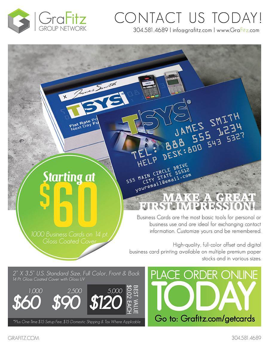
Business Card Order Form
Please fill out the form below with the necessary contact and shipping information, and the Business Card Design Information. Please double check your information before submitting. After you have submitted your business card design information order, call please 1-304-581-4689 to make your credit card payment over the phone. After your payment has been made, we will send you a proof of your business card for you to look over carefully and approve before we send the cards to the printer. If you have any questions about this process please contact Shawn Fitzpatrick at 1-304-581-4689.
*NOTE: ALL PRINT ORDERS MUST BE PAID IN FULL BEFORE ANY PROOFS WILL BE SENT TO YOU FOR REVIEW.
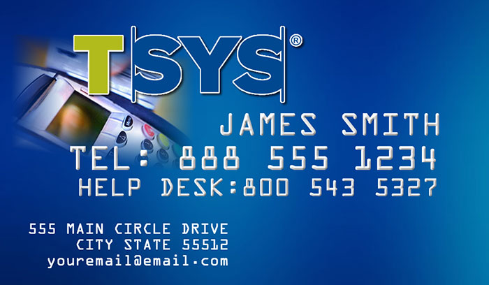
Front of Business Card

Back of Business Card
Front of Business Card
Back of Business Card
Terms and Conditions
We are committed to protecting your privacy
We collect the minimum amount of information about you that is commensurate with providing you with a satisfactory service. This policy indicates the type of processes that may result in data being collected about you. Your use of this website gives us the right to collect that information.
Information Collected
We may collect any or all of the information that you give us depending on the type of transaction you enter into, including your name, address, telephone number, and email address, together with data about your use of the website. Other information that may be needed from time to time to process a request may also be collected as indicated on the website.
Information Use
We use the information collected primarily to process the task for which you visited the website. Data collected in the UK is held in accordance with the Data Protection Act. All reasonable precautions are taken to prevent unauthorised access to this information. This safeguard may require you to provide additional forms of identity should you wish to obtain information about your account details.
Cookies
Your Internet browser has the in-built facility for storing small files - "cookies" - that hold information which allows a website to recognise your account. Our website takes advantage of this facility to enhance your experience. You have the ability to prevent your computer from accepting cookies but, if you do, certain functionality on the website may be impaired.
Disclosing Information
We do not disclose any personal information obtained about you from this website to third parties unless you permit us to do so by ticking the relevant boxes in registration or competition forms. We may also use the information to keep in contact with you and inform you of developments associated with us. You will be given the opportunity to remove yourself from any mailing list or similar device. If at any time in the future we should wish to disclose information collected on this website to any third party, it would only be with your knowledge and consent.
We may from time to time provide information of a general nature to third parties - for example, the number of individuals visiting our website or completing a registration form, but we will not use any information that could identify those individuals.
In addition Dummy may work with third parties for the purpose of delivering targeted behavioural advertising to the Dummy website. Through the use of cookies, anonymous information about your use of our websites and other websites will be used to provide more relevant adverts about goods and services of interest to you. For more information on online behavioural advertising and about how to turn this feature off, please visit youronlinechoices.com/opt-out.
Changes to this Policy
Any changes to our Privacy Policy will be placed here and will supersede this version of our policy. We will take reasonable steps to draw your attention to any changes in our policy. However, to be on the safe side, we suggest that you read this document each time you use the website to ensure that it still meets with your approval.
Contacting Us
If you have any questions about our Privacy Policy, or if you want to know what information we have collected about you, please email us at paul@dummymag.com. You can also correct any factual errors in that information or require us to remove your details form any list under our control.
Loading Animation 4-5
LOADING ANIMATION SEQUENTIALLY
Error: Something wrong there, please check your portfolio source.
LOADING ANIMATION BOTTOM TO TOP
Error: Something wrong there, please check your portfolio source.
Filter Animation 7-12
FILTER MOVE LEFT
Error: Something wrong there, please check your portfolio source.
FILTER SLIDE LEFT
Error: Something wrong there, please check your portfolio source.
FILTER FADE OUT TOP
Error: Something wrong there, please check your portfolio source.
FILTER SEQUENTIALLY
Error: Something wrong there, please check your portfolio source.
FILTER SKEW
Error: Something wrong there, please check your portfolio source.
FILTER SLIDE DELAY
Error: Something wrong there, please check your portfolio source.
Shortcodes
SHORTCODE ULTIMATE
Shortcodes Ultimate is Joomla Plugin that provides mega pack of shortcodes (like wordpress shortcode system). It's included 80+ shortcodes shortcodes item. You can easily create Accordion, tabs, buttons, icon list, animate content, google map, content sliders, responsive audio and video, photo gallery, portfolio and much much more. Turn your template to a complex design in just a few menutes. Using Shortcodes Ultimate you can quickly and easily retrieve complex content features and display it on your site. check here all shortcode so you more understand why it's need you.
Accordion
Animation
Audio
Buttons
Box Shortcode
Blockquote
Call to Action
Content Slider
Counter
Carousel
Custom Carousel
Contact Form
Countdown
Dummy Text
Dummy image
Dropcaps
Divider
Divice Slider
Document
Exit Bar
Exit Popup
Fency Text
Frame Style
Flickr Style
File Download
Flyout
Flip Box
Guest
Google Map
Gmap Advanced
Heading
Highlights
Icon
Icon List
Image Compare
Image Zoom
Instagram
Light Box
LivIcon
List Style
Load Module
Member
Modal
Note
News Ticker
Panel
Photo Panel
Pricing Table
Progress Pie
Progress bar
Photo Gallery
Portfolio
Post Grid
QR code
Row & Columns
Screenr
Shadow
Spacer
Social Like
Social Locker
Social Share
Social Feed
Section
Showcase
Switcher
Splash Screen
Spoiler Style
Table
Tabs Style
Thumb Gallery
Testimonial
Tooltip
Timeline
Trailer Box
Twitter
User Content
Video
Vimeo
Weather
YT Advanced
You Tube
Module Position
This Template has 56+ module positions
So you can use them more flexible and easily publish any module.
Drawer |
|---|
Toolbar |
|||||
|---|---|---|---|---|---|
| Toolbar L | Toolbar R | ||||
Logo |
Navbar |
||
|---|---|---|---|
Slider |
|---|
Heading |
|---|
Breadcrumbs |
|---|
Features |
|||||
|---|---|---|---|---|---|
| 1 | 2 | 3 | 4 | 5 | 6 |
Top A |
|||||
|---|---|---|---|---|---|
| 1 | 2 | 3 | 4 | 5 | 6 |
Top B |
|||||
|---|---|---|---|---|---|
| 1 | 2 | 3 | 4 | 5 | 6 |
Top C |
|||||
|---|---|---|---|---|---|
| 1 | 2 | 3 | 4 | 5 | 6 |
Top D |
|||||
|---|---|---|---|---|---|
| 1 | 2 | 3 | 4 | 5 | 6 |
Main Top |
|||||
|---|---|---|---|---|---|
| 1 | 2 | 3 | 4 | 5 | 6 |
Main Bottom |
|||||
|---|---|---|---|---|---|
| 1 | 2 | 3 | 4 | 5 | 6 |
Sidebar |
||
|---|---|---|
| Sidebar A | Sidebar B | |
Bottom A |
|||||
|---|---|---|---|---|---|
| 1 | 2 | 3 | 4 | 5 | 6 |
Bottom B |
|||||
|---|---|---|---|---|---|
| 1 | 2 | 3 | 4 | 5 | 6 |
Footer Menu |
|||||
|---|---|---|---|---|---|
| Footer L | Footer R | ||||
Debug |
|---|
Fixed |
|||||
|---|---|---|---|---|---|
| Fixed L | Fixed R | ||||
Module Variations
There are 8 stylistic module class suffixes which provide a unique style variation to the module: title1-8 and box1-8. There are also various additional structural suffixes, these affect the layout and metrics of the module.
Furthermore, you can also add FontAwesome icons into the Module Class Suffix. You will get a medium sized icon to the left of the title. Suffixes are in the icon-NAME format such as icon-star, as shown on the Typography page.
Title 1
An example module using the title1 module class suffix.
Lorem ipsum dolor sit amet, consecetur adipiscing elit donec sit amet nibh.
Title 2
An example module using the title2 module class suffix.
Lorem ipsum dolor sit amet, consecetur adipiscing elit donec sit amet nibh.
Title 3
An example module using the title3 module class suffix.
Lorem ipsum dolor sit amet, consecetur adipiscing elit donec sit amet nibh.
Title 4
An example module using the title4 module class suffix.
Lorem ipsum dolor sit amet, consecetur adipiscing elit donec sit amet nibh.
Title 5
An example module using the title5 module class suffix.
Lorem ipsum dolor sit amet, consecetur adipiscing elit donec sit amet nibh.
Title 6
An example module using the title6 module class suffix.
Lorem ipsum dolor sit amet, consecetur adipiscing elit donec sit amet nibh.
Title 7
An example module using the title7 module class suffix.
Lorem ipsum dolor sit amet, consecetur adipiscing elit donec sit amet nibh.
Title 8
An example module using the title8 module class suffix.
Lorem ipsum dolor sit amet, consecetur adipiscing elit donec sit amet nibh.
Box 1
An example module using the box1 module class suffix.
Lorem ipsum dolor sit amet, consecetur adipiscing elit donec sit amet nibh.
Box 2
An example module using the box2 module class suffix.
Lorem ipsum dolor sit amet, consecetur adipiscing elit donec sit amet nibh.
Box 3
An example module using the box3 module class suffix.
Lorem ipsum dolor sit amet, consecetur adipiscing elit donec sit amet nibh.
Box 4
An example module using the box4 module class suffix.
Lorem ipsum dolor sit amet, consecetur adipiscing elit donec sit amet nibh.
Box 5
An example module using the box5 module class suffix.
Lorem ipsum dolor sit amet, consecetur adipiscing elit donec sit amet nibh.
Box 6
An example module using the box6 module class suffix.
Lorem ipsum dolor sit amet, consecetur adipiscing elit donec sit amet nibh.
box-shadow
An example module using the box-shadow module class suffix.
Lorem ipsum dolor sit amet, consecetur adipiscing elit donec sit amet nibh.
Boxs-bevel
An example module using the box-bevel module class suffix.
Lorem ipsum dolor sit amet, consecetur adipiscing elit donec sit amet nibh.
Shopping Cart
Registration Page
Comparison Page
Product Detail Page
Affiliate Program
Blog Column 6
Blog Column 5
Error: Something wrong there, please check your post grid source.
Blog Column 4
Error: Something wrong there, please check your post grid source.
Blog Column 3
Error: Something wrong there, please check your post grid source.
Blog Column 2
Error: Something wrong there, please check your post grid source.
Showcase Masonry 5 Column
Error: Something wrong there, please check your showcase source.
Widgetkit
Widgetkit is the next generation tool set for Joomla and WordPress. This toolkit is the first of its kind! It provides a simple and user-friendly way to enrich your websites experience with slideshows, galleries, lightboxes and much more.
All widgets make use of modern web technologies like HTML5 markup, CSS3 features and jQuery based JavaScripts. Widgetkit is fully responsive and all widgets and their effects adapt perfectly for all device resolutions. It supports touch gestures and makes use of smooth CSS3 animations.
How it works
Widgetkit basically acts as a platform for all our widgets. It installs as a single component in Joomla or as a plugin in WordPress. The Widgetkit dashboard presents you an overview of all widgets. You can create, edit or delete all widgets and their content in one place. And after you have created the content for your first widget, you can either use a shortcode or a module to display your widget anywhere on your website. In fact, you can do both. Because once have you created a widget, you are able to display it multiple times and reuse it on different parts of your website.
Features
- Available for Joomla and WordPress
- All widgets are fully responsive
- Use shortcodes to show widgets anywhere
- Clean and lightweight code
- Semantic HTML5 markup
- Asset file minification and compression
- Supports touch gestures for mobile devices
- Uses hardware accelerated CSS3 animations
- Built with PHP 5.3+ and the latest jQuery version
Get Widgetkit. The next generation tool set for Joomla and WordPress. Download Widgetkit
Home
This is a hidden article.
Features
This theme is built on the Warp framework, a well-engineered theme framework for WordPress and Joomla, and utilizes all of its latest features. The user interface is powered by UIkit, a lightweight and modular front-end framework, which provides the theme's styling. The theme also comes with a wide range of different layouts and widget variations.
Warp Framework
A fast and slick theme framework which is built on the latest web techniques like HTML5, CSS3 and PHP 5.3+
UIkit
A lightweight and modular front-end framework for developing fast and powerful web interfaces.
This theme is available for  Joomla and
  WordPress including the same features on each system.
Dummy Content
Lorem ipsum dolor sit amet, consectetur adipisicing elit, sed do eiusmod tempor incididunt ut labore et dolore magna aliqua. Ut enim ad minim veniam, quis nostrud exercitation ullamco laboris nisi ut aliquip ex ea commodo consequat. Duis aute irure dolor in reprehenderit in voluptate velit esse cillum dolore eu fugiat nulla pariatur. Excepteur sint occaecat cupidatat non proident, sunt in culpa qui officia deserunt mollit anim id est laborum.
TYPOGRAPHY (UIKIT)
UIKIT DEFAULTS
These components generally normalize HTML elements for cross browser functionality and add some very basic styling.
HEADINGS
Use the <h1> to <h6> elements to define your headings.
h1 Heading 1
h2 Heading 2
h3 Heading 3
h4 Heading 4
h5 Heading 5
h6 Heading 6
PARAGRAPHS
The global font-size, line-height and regular margins between elements are set through variables, which can be customized. Paragraphs and other block elements stick to these values.
Lorem ipsum dolor sit amet, consectetur adipisicing elit. Voluptates cum eaque possimus delectus accusamus a, repellat reprehenderit odit tempora unde, consectetur in, assumenda odio dolore beatae optio sed accusantium iste. The global font-size, line-height and regular margins between elements are set through variables, which can be customized. Paragraphs and other block elements stick to these values.
BLOCKQUOTES
Lorem ipsum dolor sit amet, consectetur adipisicing elit, sed do eiusmod tempor incididunt ut labore et dolore magna aliqua. Ut enim ad minim veniam.
Someone famous
TEXT-LEVEL SEMANTICS
The following list gives you a short overview of the most commonly used text-level semantics and how to utilize them.
| Element | Description |
|---|---|
<a> |
Turn text into hypertext using the a element. |
<em> |
Emphasize text using the em element. |
<strong> |
Imply any extra importance using the strong element. |
<code> |
Define inline code snippets using the code element. |
<del> |
Mark document changes as deleted text using the |
<ins> |
Mark document changes as inserted text using the ins element. |
<mark> |
Highlight text with no semantic meaning using the mark element. |
<q> |
Define inline quotations using q element.insidea q element |
<abbr> |
Define an abbreviation using the abbr element with a title. |
<dfn> |
Define a definition term using the dfn element with a title. |
<small> |
De-emphasize text for small print using the small element. |
UIKIT LAYOUT
Apply our fully responsive fluid grid system and panels, common layout parts like blog articles and comments and useful utility classes.
UIKIT GRID
Create a fully responsive, fluid and nestable grid layout.
The grid system of UIkit follows the mobile-first approach and accomodates up to 10 grid columns. It uses units with predefined classes inside each grid, which define the column width. It is also possible to combine the grid with classes from the Flex component, although it works only in modern browsers.
| Class | Description |
|---|---|
.uk-width-1-1 |
Fills 100% of the available width. |
.uk-width-1-2 |
Divides the grid into halves. |
.uk-width-1-3 to .uk-width-2-3 |
Divides the grid into thirds. |
.uk-width-1-4 to .uk-width-3-4 |
Divides the grid into fourths. |
.uk-width-1-5 to .uk-width-4-5 |
Divides the grid into fifths. |
.uk-width-1-6 to .uk-width-5-6 |
Divides the grid into sixths. |
.uk-width-1-10 to .uk-width-9-10 |
Divides the grid into tenths. |
.uk-width-1-3.uk-width-1-3.uk-width-1-3.uk-width-1-2.uk-width-1-2.uk-width-3-10.uk-width-7-10FLEX AND GRID
Flex Grid Title
Lorem ipsum dolor sit amet, consectetur adipisicing elit. Lorem ipsum dolor sit amet, consectetur adipisicing elit. Lorem ipsum dolor sit amet, consectetur adipisicing elit. Lorem ipsum dolor sit amet, consectetur adipisicing elit. Lorem ipsum dolor sit amet, consectetur adipisicing elit.
UIKIT PANEL
Create layout boxes with different styles.
UIkit uses panels to outline certain sections of your content, which can be styled differently. Typically, panels are arranged in grid columns from the.
The Panel component consists of the panel itself, the panel title and a panel badge. To prevent redundant white space, top and bottom margins are removed from the panel's content. Get more option to visit Grid component.
| Class | Description |
|---|---|
.uk-panel |
Add this class to a <div> element to define the Panel component. |
.uk-panel-title |
Add this class to a heading to create the panel title. |
.uk-panel-badge |
Add this class to a <div> element to create a panel badge. The easiest way to style your badge, is by adding the modifier classes from the Panel. |
Hot
Title
Lorem ipsum dolor sit amet, consectetur adipisicing elit, sed do eiusmod tempor incididunt ut labore et dolore magna aliqua.New
Title
Lorem ipsum dolor sit amet, consectetur adipisicing elit, sed do eiusmod tempor incididunt ut labore et dolore magna aliqua.Populer
Title
Lorem ipsum dolor sit amet, consectetur adipisicing elit, sed do eiusmod tempor incididunt ut labore et dolore magna aliqua.PANEL WITH ICON
Easily apply an icon from our Icon component to your panel by adding one of the .uk-icon-* classes to an <i> or <span> element inside the panel title.
Panel
Lorem ipsum dolor sit amet, consectetur adipisicing elit, sed do eiusmod tempor incididunt ut labore et dolore magna aliqua.Panel
Lorem ipsum dolor sit amet, consectetur adipisicing elit, sed do eiusmod tempor incididunt ut labore et dolore magna aliqua.Panel
Lorem ipsum dolor sit amet, consectetur adipisicing elit, sed do eiusmod tempor incididunt ut labore et dolore magna aliqua.UIKIT BLOCK
Separate content sections by bundling them in blocks with different styles.
To apply this component, just add the .uk-block class to a container element.
To apply different background colors and paddings, add one of the following classes. If two consecutive blocks have the same background color, the padding will automatically be divided.
| Class | Description |
|---|---|
.uk-block-default |
Add the default background color, usually white or similar. |
.uk-block-muted |
Adds a light background color. |
.uk-block-primary |
Adds a primary background color. |
.uk-block-secondary |
Adds a another background color, usually a dark one. |
Block
Lorem ipsum dolor sit amet, consectetur adipisicing elit, sed do eiusmod tempor incididunt ut labore et dolore magna.
Lorem ipsum dolor sit amet, consectetur adipisicing elit, sed do eiusmod tempor incididunt ut labore et dolore magna.
Lorem ipsum dolor sit amet, consectetur adipisicing elit, sed do eiusmod tempor incididunt ut labore et dolore magna.
UIKIT ARTICLE
Create articles within your page.
The article component constists of the article itself, a title, meta data, an opening paragraph and dividers.
| Class | Description |
|---|---|
.uk-article |
Add this class to define the Article component. Typically you would use an <article> element for this. |
.uk-article-title |
Add this class to a heading to create an article title. Typically you would use a <h1> element for this. |
.uk-article-meta |
Add this class to a paragraph which contains meta data about your article. |
.uk-article-lead |
Add this class to the opening paragraph of your article to highlight it. |
.uk-article-divider |
Add this class to a <hr> element to create a divider seperating different sections of your article. |
Article title
Lorem ipsum dolor sit amet, consectetur adipisicing elit, sed do eiusmod tempor incididunt ut labore et dolore magna aliqua.
Lorem ipsum dolor sit amet, consectetur adipisicing elit, sed do eiusmod tempor incididunt ut labore et dolore magna aliqua. Ut enim ad minim veniam, quis nostrud exercitation ullamco laboris nisi ut aliquip ex ea commodo consequat.
Lorem ipsum dolor sit amet, consectetur adipisicing elit, sed do eiusmod tempor incididunt ut labore et dolore magna aliqua. Ut enim ad minim veniam, quis nostrud exercitation ullamco laboris nisi ut aliquip ex ea commodo consequat.
Read moreCOMMENT
Create comments, for example about articles.
The Comment component consists of a comment header, including an avatar, a title and meta data, and a comment body.
| Class | Description |
|---|---|
.uk-comment |
Add this class to define the Comment component. |
.uk-comment-header |
Add this class to create a comment header. |
.uk-comment-avatar |
Add this class to an <img> element to create an avatar for the comment author. |
.uk-comment-title |
Add this class to a heading to create a comment title. |
.uk-comment-meta |
Add this class to a paragraph to create meta data about your comment. |
.uk-comment-body |
Add this class to a <div> element to create comment body. |
UIKIT COMMON
Here you'll find components that you often use within your content, like buttons, icons, badges, overlays, animations and much more.
BUTTON
Easily create nicely looking buttons, which come in different styles.
To apply this component, add the .uk-button class to an <a> or <button> element. Now you have created a button. Add the disabled attribute to a <button> element to disable the button.
COLOR MODIFIERS
There are several color modifiers available. Just add one of the following classes to apply a different look.
| Example | Class | Description |
|---|---|---|
.uk-button-primary |
Emphasizes to identify the primary action in a set of buttons. | |
.uk-button-success |
Indicates a successful or positive action. | |
.uk-button-danger |
Indicates a dangerous or negative action. | |
| Link | .uk-button-link |
Deemphasizes to look like a link while maintaining button behavior. |
SIZE MODIFIERS
Add the .uk-button-mini, .uk-button-small or .uk-button-large class to a button to make it smaller or larger.
FULL WIDTH BUTTON
Add the .uk-width-1-1 class from the Grid component and the button will take up full width.
BUTTON GROUP
To create a button group, add the .uk-button-group class to a <div> element around the buttons. That's it! No further markup needed.
BUTTON WITH DROPDOWNS
A button can be used to trigger a dropdown menu from the Dropdown component. Just add the .uk-button-dropdown class and the data-uk-dropdown attribute to a <div> element that contains the button and the dropdown itself.
UIKIT ALERT
Defines styles for success, warning and error messages.
To apply this component, add the .uk-alert class to a block element.
To apply a close button, add the .uk-alert-close class to a <button> or <a> element inside the alert box. To enable the JavaScript for the close button, just add the data-uk-alert attribute to the alert box. We recommend adding the .uk-close class from the Close component to give the button a proper styling, though you can also use text or an image. More option visit Uikit Alert.
SIZE MODIFIER
Add the .uk-alert-large class to increase the spacing in an alert box. This can be useful, if you want to use richer typography.
Today's headline
Lorem ipsum dolor sit amet, consectetur adipisicing elit, sed do eiusmod tempor incididunt ut labore et dolore magna aliqua. Ut enim ad minim veniam, quis nostrud exercitation ullamco laboris nisi ut aliquip ex ea commodo consequat.
UIKIT ANIMATION
A basic collection of smooth animations to use within your page. For more options please visit Uikit Animation
To apply this component, add any .uk-animation-* class to an element and it will fade in with a nice animation. These classes are commonly set by using JavaScript to apply the animation to specific behaviors.
| Class | Description |
|---|---|
.uk-animation-fade |
The element fades in. |
.uk-animation-scale-up |
The element scales up. |
.uk-animation-scale-down |
The element scales down. |
.uk-animation-slide-top |
The element slides in from the top. |
.uk-animation-slide-bottom |
The element slides in from the bottom. |
.uk-animation-slide-left |
The element slides in from the left. |
.uk-animation-slide-right |
The element slides in from the right. |
.uk-animation-shake |
The element shakes. |
.uk-animation-scale |
The element scales down without fading in. |
Hover over any of the boxes to see the animation.
Fade
Scale up
Scale down
Shake
Icons
YOOtheme is a well-known template and extension provider for Joomla and WordPress who helps you to create professional websites. But to make your website or interface design a real eye-catcher there was one thing missing: Icons! Icons are an essential tool to simplify user interfaces and today almost every major website uses icons to highlight important parts in their content.
Features
PNGs in 8 Sizes
From 16x16 to 512x512 pixels.
Scalable vector sources
Customizable PDF vector files.
Pixel perfect design
Handcrafted every size.
YOOtheme Icons. Beautiful and handcrafted icons for web and print projects. Visit Website
CONTACT US
-
Phone: (304) 581-4689
-
Mailing:
PO Box 71
Huntington, WV 25706
SHARE US
At GraFitz Group Network, we believe that promoting your business is also promoting ourselves.
See something you like? Share it with the world so they can see it too!
Author
Lorem ipsum dolor sit amet, consetetur sadipscing elitr, sed diam nonumy eirmod tempor invidunt ut labore et dolore magna aliquyam erat, sed diam voluptua.
Author
Lorem ipsum dolor sit amet, consetetur sadipscing elitr, sed diam nonumy eirmod tempor invidunt ut labore et dolore magna aliquyam erat, sed diam voluptua.